Poster inspo - dionne
|
|
|
|
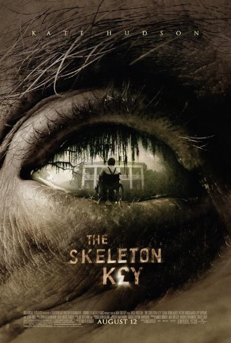
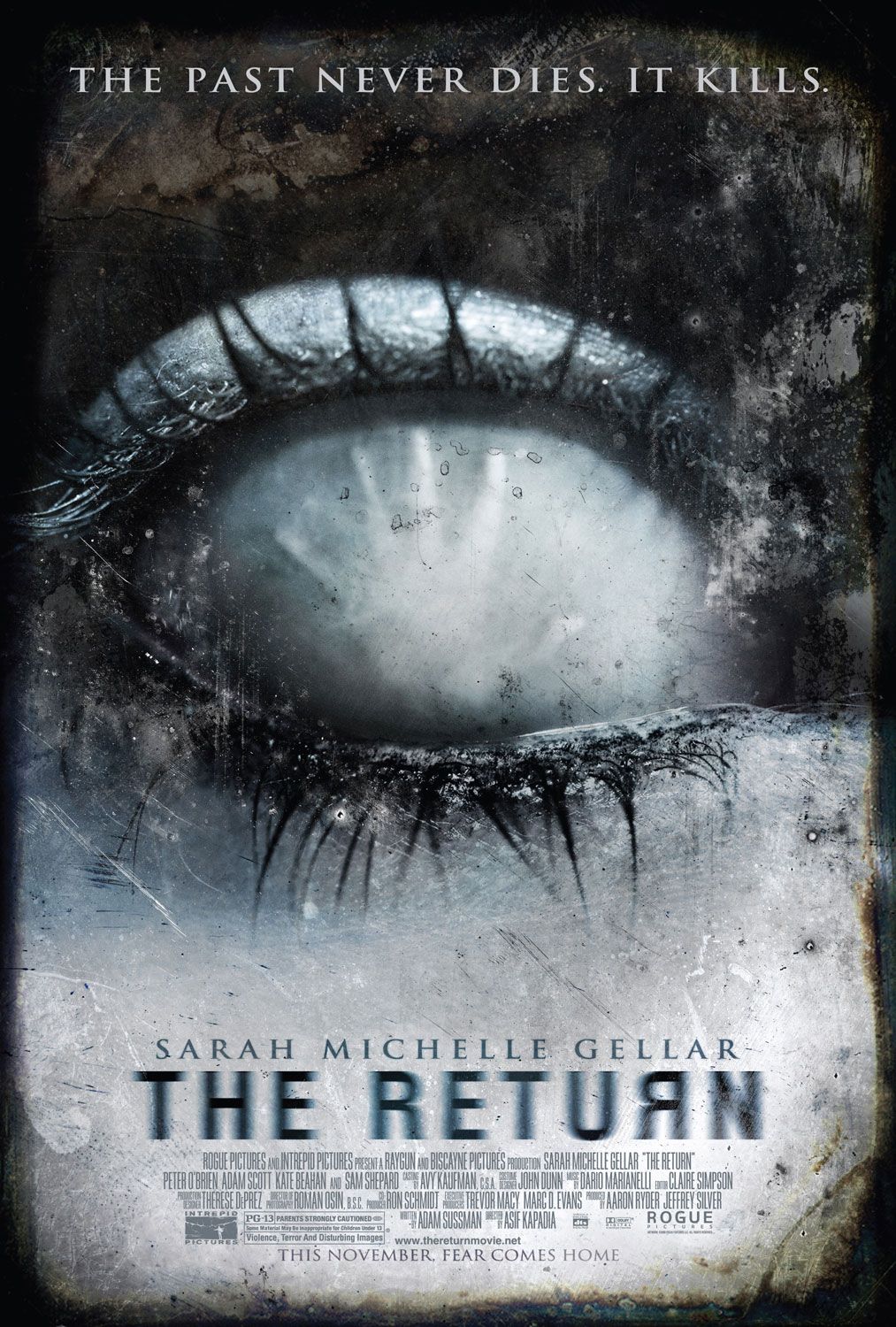
I chose the skeleton key as inspiration as they have a character within the eye that shows part of the background to the film while also using direct eye contact with the viewer the colours are also monochromatic which adds to the errie effect
|
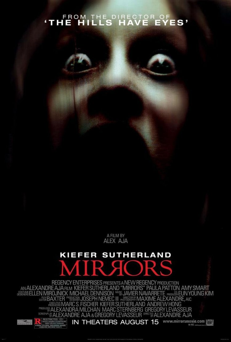
Mirrors uses dark colour to signify death an has the face coming up from the darkness. i also liked the colour scheme in relation to our mood board of colour which is red black white and green.
|
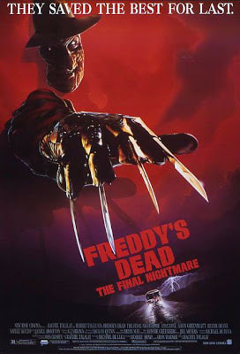
in freddys dead the final nightmares poster the use of the consitent read the poster looks like bloodit also shows a large weapon as its main point using the psychology phenomenon weapon focus effect. this is also a largeconnection to the character of freddy as it is his main weapon
|
These images show the antagonist and the protagonist interacting with one another. It shows us the abilities of the antagonist and how the antagonist is involved.
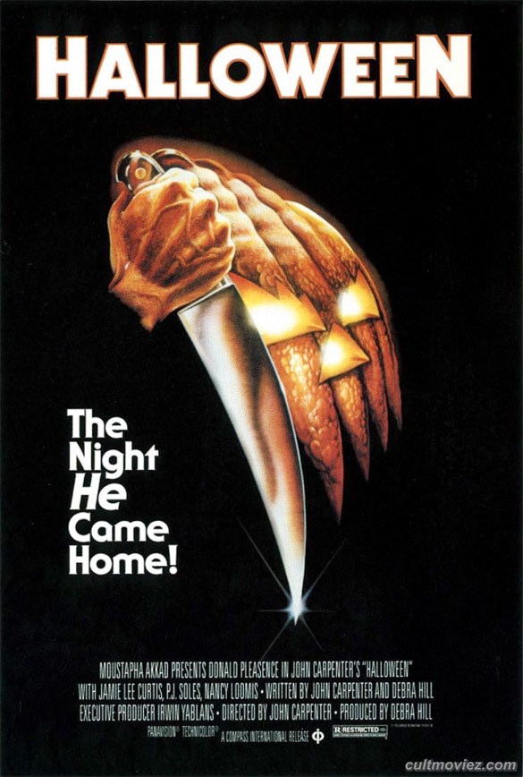
This image shows the tagline an also clearly shows its colour scheme black,white and orange. this is subverted the normal style of : Black, white and red.
The connotations fro that are - Black for death, White for innocence and hope, An Red for blood meaning life. |
This poster contains the protagonist trapped on the inside of the eye. it shows the antagonists threat and the protagonists weakness.
|
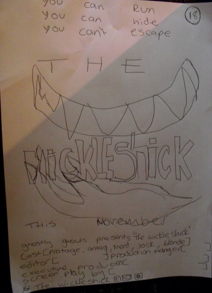
Hand Drawn Draft - Poster. - dionne
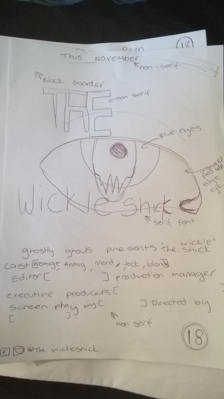
in this rough draft i have used the billing block and but it at the bottom i have also shown the age restriction due to the amount of gore that will likely be portrayed the name of the monster will be printed across the front as a ideal for other monster horrors like jaws and frankenstein (however this is the working title). i used the idea from the skeleton key to show a brief glimpse of the monster. the idea being that it is the last thing you see before you die at the hands of it i thought that this would be effective in portraying who the antagonist is while also exploring the colours i will likely be using. i used the month of its release at the top so that the audience would be more likely to look the film up so that it builds more interest.
|
in this i have used the same idea for a billing block however i did not put a restriction age as this was made to be more plain with the image as the main source. the date is lower down the page and the title is bigger to show that it was more important than the rest of the poster as the name of the monster is important to the tone of the film. it also means that the title and the image have to be matching in the theme i.e. jaws having the main attribute being its teeth. The teeth are going to be yellowed and the skin with a blue hue. the edges of the image are going to be black and fading around the mouth and claws. the title is in a
|
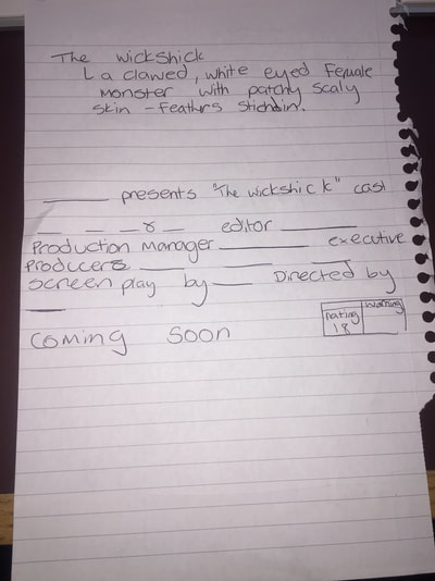
this is the billing block that i designed before typing up on the digital designs
Digital - dionne
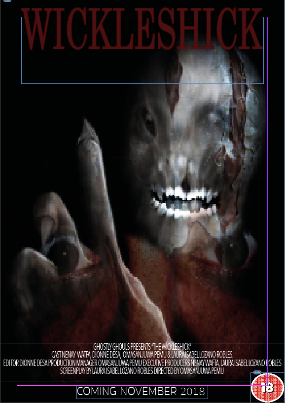
.in the posters i used the same mock up image which i put into photoshop to add details such as teeth,claws and the eyes which were layered over the top.
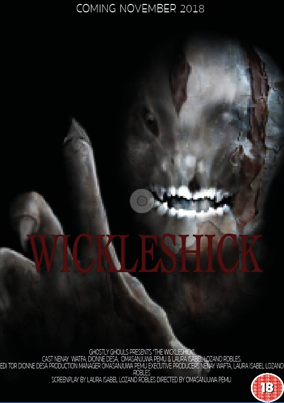
the idea for this poster is that the monster owns its name and is in control this is why it is singular and reaching out to the camera. the text is red to signify blood that drenches its name due to the amount of gore an the people she kills (the monster is described as female) the white text at the bottom is so that is comes off the page and is easier to read. as i said before the billing is being used to create on interest in the film. The monster is said to rip apart its bodies before eating them. to do this it needs extra long claws and teeth. this is the weapon in the monster genre - parts of the body that are unnatural but therefore dangerous.
|
this poster is used to be a direct line of address between antagonist and protagnist. the eyes are wide in fear which shows the clear divide. the hands are reaching out to the face to show entrapment as the monster is close enough that you cannot escape.i have alos put the age range in the bottom corner so it is visible and shows what type of violence rating it will have.
|
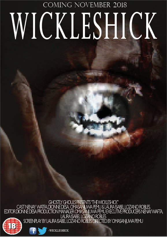
this follows my first paper design that uses the close up of the eye to create a personal and direct contact. in this one unlike the others i have added social media this is so that it shows that it follows the newer conventions of a poster. all the logos and the target audience logo are on one side so that they dont distract from the rest of the poster like the image as that links the most to the trailer idea.
Magazine Inspo - dionne
|
|
|
|
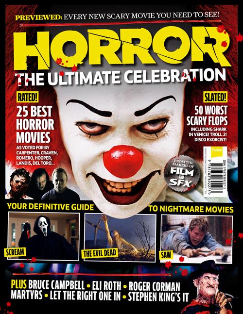
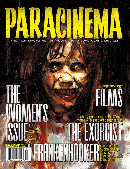
in this magazine cover it follows the same colour scheme as the one i wanted to create.it also has secondary images of different films and a plus section at the bottom. the close up is effective in showcasing the antagonist. the poster has boosts showin fx. however this magazine=e doesn't use the title on the cover.
|
i chose this magazine as general movie magazine as it is less cluttered also that it had a two-colour, colour scheme.. it also has the title of the film across the magazine to show what the main focus of the magazine is.
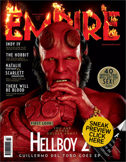
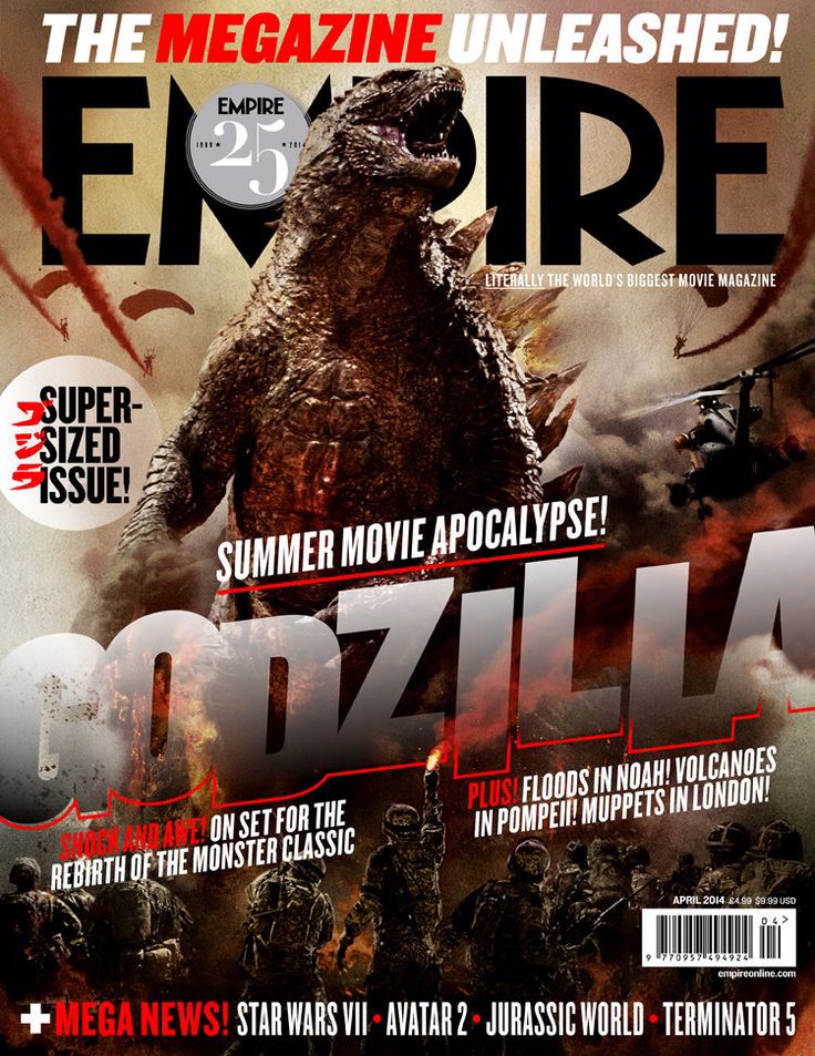
Empire is the best layed out as it still has the movie as a front cover but the image is not covered by unnecessary boosts
|
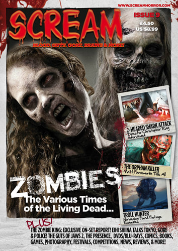
this magazine has the must ruled outline. i used this to repeat the structure as well. as this is a horror magazine i also expected to see the tagline under the main cover line.
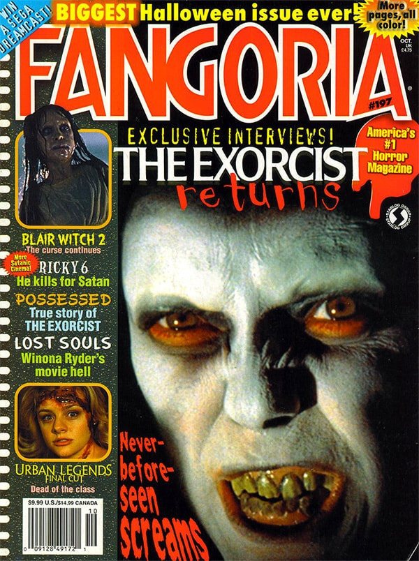
We wont be using the older fangoria versions as they are too clustered and the boarders take away from the main image.
|
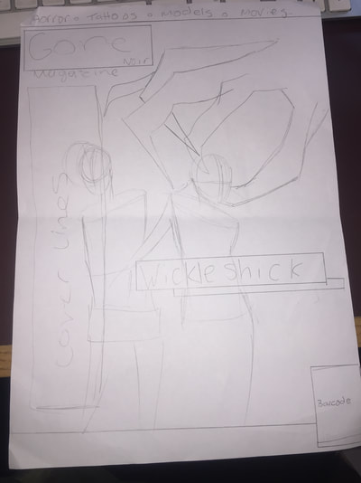
Hand Drawn Draft - Magazine - dionne
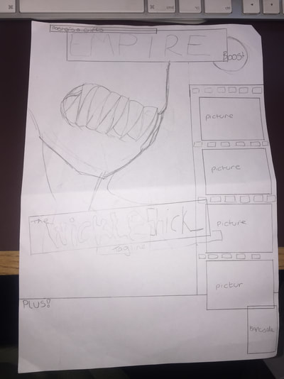
this draft has the masthead at the center top as it is imitating empire it also has a set of secondary images down the side that would be taken by our group to keep the original content. it has a boost to advertise the inside of the magazine. ive used the close up shot of the monster to show the fangs. the main coverlines have the film title and the tag line.
|
in this draft the mast head and coverlines are moved to the side so that there is more room for the image to be shown clearly. the title and tagline are still the main coverlines this is so the=at you can associate the name with the picture.
|
Digital - dionne
for these digitals i kept the same colour scheme as it is the most common
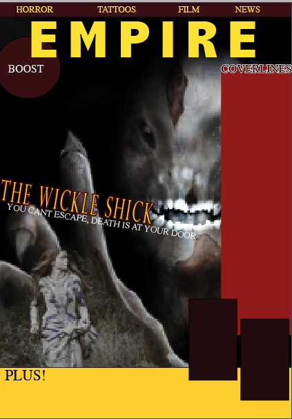
on this magazine cover i did the rough detail. partsthis includes the mast head a boost and a series of coverlines (areas which have be cornered off. the secondary images are going to be screen shots from the actual trailer so that "parts of the film" can be shown this is used to allow readers/viewers?fans of the magazines
|
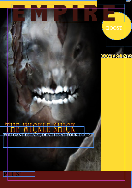
this magazine cover focuses on being clearer than the other, .the plus at the bottom is smaller so that more coverlines can be added. the colours contrast better as the yellow and red are not to bright this makes it look darker and is more effective for a horror magazine. there are no secondary images so that the eye is not drawn away from the main image.
|
