Neneh Watfa
Audience feedback was important with our horror trailer, magazine and trailer, due to the fact that it allowed us to see first hand what our target demographic thought out our media products and the positive but also the negative things, which allowed us to know what we did well, regarding horror films and what we could have changed or improved.
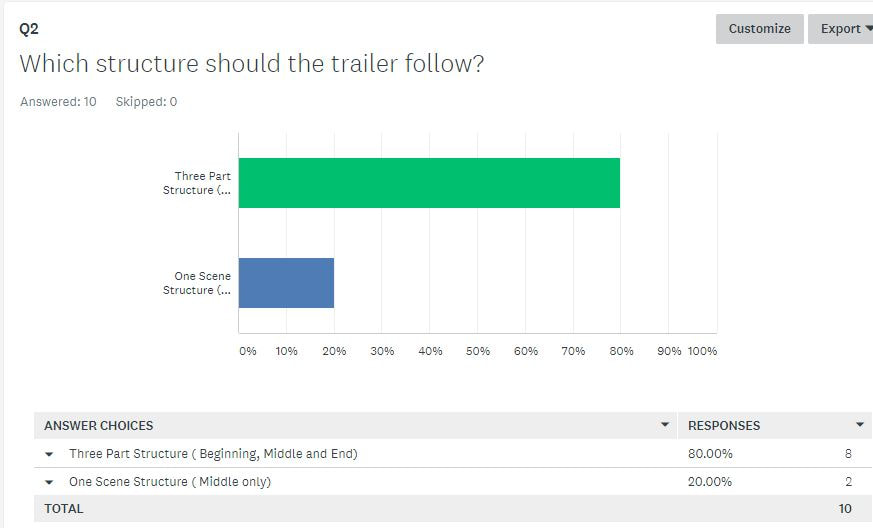
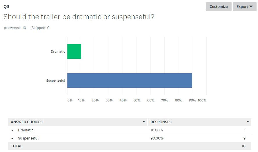
Before we started our production, we had carried out audience research , where we asked people within our target demographic what was the typical conventions but also extra items that they would expect to see in a horror trailer, magazine and poster. The feedback from our audience researched us and guided us when we was producing each work, making sure that we always used the information we got from audience research to make our products how the target demographic would have liked to see it and not just make our productions just our liking but so that our audience would enjoy it. Seeing as our target demographic was 17-21, we also had to make sure that the content would be suitable for our age range. From our audience research, regarding to the trailer, we found that majority of the people we had asked though that our trailer should have followed a three part structure and it should have been suspenseful. With our trailer, we decided not to follow a three part structure but instead just to follow the disequilibrium structure as we felt that this would be more effective with the type of trailer that we was making. From the audience research, we found that people wanted the trailer to be very suspenseful and we decided to do this with the trailer, by adding a variety of jump cuts, black outs and montages, so that the trailer was not actually in order and because some part were sped it, it made our trailer even more suspenseful because of the fact that it would have been more interactive to watch then the parts of the film just going in order.
Before we started our production, we had carried out audience research , where we asked people within our target demographic what was the typical conventions but also extra items that they would expect to see in a horror trailer, magazine and poster. The feedback from our audience researched us and guided us when we was producing each work, making sure that we always used the information we got from audience research to make our products how the target demographic would have liked to see it and not just make our productions just our liking but so that our audience would enjoy it. Seeing as our target demographic was 17-21, we also had to make sure that the content would be suitable for our age range. From our audience research, regarding to the trailer, we found that majority of the people we had asked though that our trailer should have followed a three part structure and it should have been suspenseful. With our trailer, we decided not to follow a three part structure but instead just to follow the disequilibrium structure as we felt that this would be more effective with the type of trailer that we was making. From the audience research, we found that people wanted the trailer to be very suspenseful and we decided to do this with the trailer, by adding a variety of jump cuts, black outs and montages, so that the trailer was not actually in order and because some part were sped it, it made our trailer even more suspenseful because of the fact that it would have been more interactive to watch then the parts of the film just going in order.
From the audience research, we found that majority of people who answered our survey about what our trailer should have included, they said the trailer should included some type of dialogue and also some sound effects as they believed that this would make the trailer more effective.
Magazine Survey
Dionne Desa

Magazine Feedback Videos
Neneh Watfa
Trailer Feedback
Omasan Pemu
Survey
Survey Feedback
The feed back we received from the survey for the trailer was overall positive, however there is some room for improvement.
In Question 1 everyone said that they like the trailer, which was a positive feedback as one of the main aims was for the audience to enjoy our trailer. In Question 2 you can see that the response varies, as some people find it scary but some others don't and others find it a little bit scary, however our aim was to make others terrified, which as you can see only worked to an extent showing that we have to improve our trailer. Maybe we could've improved our soundtrack and add some more graphic content, that would create visceral effect on the viewers.
In Question 3 as you the main answer, was that it looks quite professional, but it still looks like a students work, meaning that our work could've been drastically improved. Most people thought that the sub-genre was Slasher, Japanese Horror or Monster. The sub-genre for our trailer was Slasher and Monster, showing that we did make it clear.
Question 5 shows that the captions did help to narrate the trailer, which was the aim, in Question 6 most people didn't find the trailer to predictable, however other did, and the answers were both really close to each other, showing that it depended on the audience member watching it, if they would find it predictable or not. Most people felt like the main character is not shown enough times in Question 7, showing that we should've included her more. Most people said that the captions were used effectively in Q8, which was our aim for them, however we could have used more effects in the captions and also slow down the speed of the writing. Most people believed the jump scares were effective in Q9, however we could've added more at that point, so the others who didn't feel like they were effective, would've changed their opinion. On a scale of 1-10 the average rating was 3. on the effectiveness of the horror conventions, showing that they need to be included more.
Social Media Used for feedback
The types of social media i used were iMessage and Snapchat, through this i was able to receive feedback from other people, through interacting with them, and sending them the link to our trailer, so they were able to evaluate our work. This enabled us as it was faster and more convenient, for both the and audience.
|
|

|
Here is the feedback that we received from our audience, as you can see majority said the enjoyed the trailer, and how it was edited, however the transitions of the text was too fast. They enjoyed the visuals, but the trailer wasn't scary and it seemed more like a Thriller than a horror trailer. We also received some negative feedback about the sound track, one person said they feel like more ambient sound effects should've been added to the audio. This allowed us to realize the importance of the sound in the horror trailer, as it does help set the mood and atmosphere.
Trailer Video Reactions
Neneh Watfa
Poster Survey
Laura Isabel Lozano-Robles
|
Movie posters are ways for advertising film since the early 1900's. This form of advertisement allows anyone to see and does't limit people without internet because posters are placed everywhere: bus stops, billboards, public transport, cinemas, newspapers, magazines, electronic screens etc.. we kept the continuity of the typography by keeping the same font from the poster, magazine and trailer. |
|
Questions
1) Do you think that the photograph for the front cover is effective?
2) Do you think that tagline "BE AWARE THE NECROSIS IS HERE" is catchy?
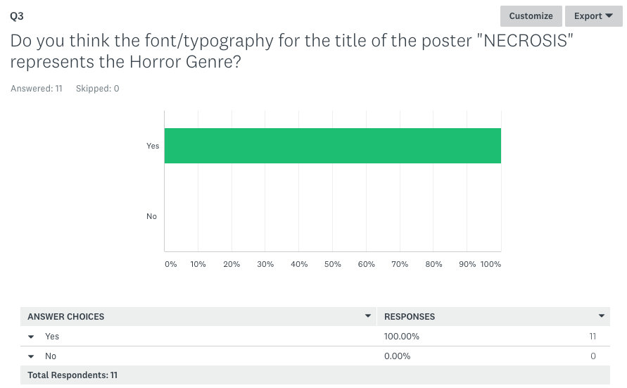
3) Do you think the font/typography for the title of the poster "NECROSIS" represents the Horror Genre?
4) When looking at the poster what grabs your attention? photograph, typography etc?
5) What are the Pros and Cons for our poster?
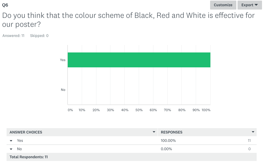
6) Do you think that the colour scheme of Black, Red and White is effective for our poster?
7) Does the Poster look realistic?
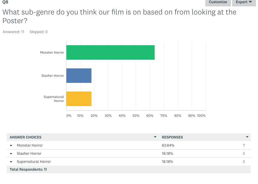
8) What sub-genre do you think our film is on based on from looking at the Poster?
9) Do you think our poster resembles any other real movie poster?
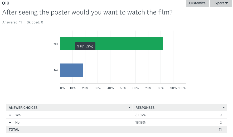
10) After seeing the poster would you want to watch the film?
1) Do you think that the photograph for the front cover is effective?
2) Do you think that tagline "BE AWARE THE NECROSIS IS HERE" is catchy?
3) Do you think the font/typography for the title of the poster "NECROSIS" represents the Horror Genre?
4) When looking at the poster what grabs your attention? photograph, typography etc?
5) What are the Pros and Cons for our poster?
6) Do you think that the colour scheme of Black, Red and White is effective for our poster?
7) Does the Poster look realistic?
8) What sub-genre do you think our film is on based on from looking at the Poster?
9) Do you think our poster resembles any other real movie poster?
10) After seeing the poster would you want to watch the film?
|
Question 1: what I found out on this question is that all of the people who answered our first question agreed "that the photograph for the front cover is effective?" This shows us that our dominant image and photography was professional and effective and it seemed realistic and effected the audience in a emotional way. "emotional pleasure" |
|
|
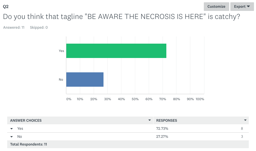
Question 2: on this question we found out that 72.73% of the respondents said that the tag line to our survey found the tag-line This suggests that we used the convention for horror posters, of the tagline effectively as our more than half of our target audience found the tag line Catchy. |
|
Question 3: 100% of the participants agreed that "the font/typography for the title of the poster "NECROSIS" represented the Horror Genre" so we followed the followed and applied the convention correctly our the horror genre typography. |
|
|
|
Question 4: on this question the majority said that the image grabbed their attention first because of three reasons one of them being that it is what takes more than half of the layout so evidently you eye directly looks at it first second that the being the editing and thirdly the make-up. |
|
Question 5: the pros for our poster were mostly based not the makeup up, editing of the face and photography and typography. moreover we also asked for cons and we given the feedback that there could have been something on the background of the image to make it even more interesting and also that writing in some areas was hard to read. the most praise we got was for the photography and editing. |
|
|
Question 6: 100% of the people who answered the survey said that the colour was effective for our poster. this shows that they mixed well together making it look effective and visually pleasing. |
|
|
Question 7: the question for whether or not our poster looked realistic was answered with 81.82% agreeing that it was. some of the reason for people agreeing was that they said the layout was conventional so it made it realistic the laurels, billing block and social media icons also helped this become more realistic.
|
|
Question 8: 63.64% thought that our film was Monster genre; and 18.18% thought slasher and 18.8% thought supernatural. these results tell us that our poster does resemble the sub- genre of our film and so it allows it to be recognisable for monster genre fans and telling us we achieved the goal of using the monster conventions in our poster. |
|
|
|
Question 9: for this question the majority 72.73% said that our poster didn't resemble any other poster which meant that I achieved my goal of taking inspiration of other posters however not making it identical which could result in copyright issues and also some negative comments from fans of those films. so for the poster to be unique will also it to grab the attention of horror fans as its different and it will intrigue them to watch it. |
|
Question 10: The final question of the survey was answered with 81.82% of people agreeing that they would want to watch the film after seeing the poster. this result in our poster being successful as it had fulfilled its purpose of promoting the film for the outcome to be that people watch it and crease box office views. a reason we may have not reached the ultimate goal of 100% could be because some of our target audience may not like watching Horror films or we didn't meet there exceptions for the poster. |
|
Poster Feedback Videos
Neneh Watfa
We conducted video interviews to ask people who were within our target audience range at set of questions about the poster overall and who it appeals to them. From our video, we found out that majority of people liked our poster overall and hardly had any improvements in which they thought was necessary to make our poster even better than it already is. We found out that our main dominant image was the most appealing and vocal feature of our poster, making the poster stand out and really promoting our film.
Conclusion
Neneh Watfa
Doing audience research has helped us to learned what went well overall with our media products, to see if we met the requirements of what our audience was looking for and where we failed these expectations and what we would changed about this if we was to repeat the task again. After gathering all of our audience research, we was able to conclude that overall our media products met the expectation of what our audience wanted from a trailer, magazine and a poster. From our feedback, we learnt that with in regards to our trailer, majority of the people that we asked believed our trailer was good and that it would promote them to watch to go and watch the film, this means that we met lot of our target audience expectations regarding to what actually makes a trailer exhilarating and appealing to our audience. While majority of the feedback we received about our final trailer was productive, there was still things that people believed could been improved, such as adding more cuts which are a bit more dramatic to make it more exciting or editing the sound design to make it fit in more with the content on each section. If we was to re-make our trailer again, these are the two main things that we would forward our focus to make our trailer more effective and engaging with our audience. With our poster, from our feedback, we learnt that our main dominant image was one of the things that made our magazine. We learnt from our feedback that majority of our audience liked our poster overall as a whole and that it promoted the film very much as many believed that our poster looked very real and authentic. In regards to compliments, the only criticism that the poster received was to town down the effects on the protagonist's hand to make it look even more effective. From our audience research, we gathered that our magazine was the least effective product to helping to promote the film, while the magazine ha some good feedback regarding layout of our magazine and either text or typography, however, there was a lot of improvements which could have taken our magazine to the next level, thing such as using a lighter background so that our main dominant image stood out more, changing and taking away some of the cover lines on the magazine so that it is not so crowded.
