Introduction
Neneh Watfa
Having a strong brand is important for any film as it helps to build and create a franchise, which then helps with promotion of the film. The idea of Synergy and continuity are both very important factors, especially when creating and trying to build up our brand identity for all three of our products. Whilst making and building our brand name, we also look at media convergence, which is the merging of different forms of media to create new and different ways of communications and promoting products. Media Convergence helps a lot with brand identity , as it helps with the publications and marketing of a media product, using different products and technology software to help promote the brand, which helps gains an audience for your franchise. Media convergence involves the use of digital technologies, such as smartphones, digital software's, Blu-ray and DVD..
Here we talk the brand identity for our film ' Necrosis' and we compare it to other real media texts and we willl see how our brand identity and other brand identities contrasts with each other.
Here we talk the brand identity for our film ' Necrosis' and we compare it to other real media texts and we willl see how our brand identity and other brand identities contrasts with each other.
Laura Isabel Lozano-Robles

Success of Real Media Text
Batman Franchise
Omasan Pemu
Batman is a good example of a franchise that used Cross-media convergence and synergy, as t is a collection of different movies, novels, comic books, TV shows and Video games. The character Batman first appeared on May 26, 1939 In Detectives comics. The Batman movies have been produced by DC Comics, DC Entertainment, Warner bros Animation, Warner Bros, Syncopy Inc, Cruel and Unusual Films, and Mattel. Since then the character has been re-introduced and has become a franchise. As it now has its own movies and TV shows, which are distributed around the world. This uses CMC, as it can be viewed on the TV, and it is also sold on blu-ray & DVD. Due to digital technology people are also able to access the movie, and TV shows through their digital devices, such as Phones, Tablets and IPods.
Detective Comics : Batman 1939
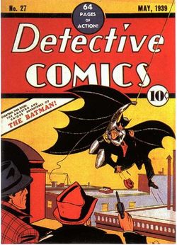
The Detective Comics, was first Published in 1937. It is best Known for introducing the superhero Batman is #27 in 1939. Due to the fact that Batman was very popular the superhero character became more famous allowing, The Batman Franchise to then be created. This paved the way for the Batman Franchise to grow which led it to becoming well successful today, as there are now many Batman movies, Games and TV shows, which are displayed on many different Digital Media Platforms.
Batman Movie Posters
Release Date : 21 July 2008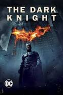
|
Release Date : 20 July 2012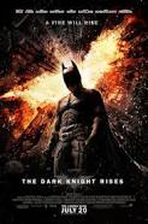
|
Release Date : 25 March 2016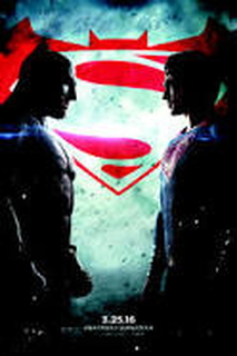
|
Release Date : 16 June 2005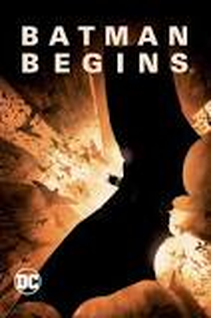
|
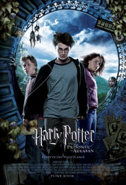
These are Movie Posters created for different Batman Movies, such as Batman V Superman, Batman begins, The Dark Knight, and The Dark Knight Rises. These posters were used as a form of advertisement, which would then be placed on may places, such as Bus stops, Buses and Billboards, also through online advertisement as well. These Posters were all created at different times, for example The Batman Begins movie was released in 2005, and Batman V Superman was released in 2016. As you can see the Batman Franchise has grown and adapted through out the years, which has allowed it to be successful
Batman Movie trailers
|
|
|
|
Batman is a good example of synergy, as it's synergistic relationship with YouTube. As you can see people are able to view the trailers on YouTube. As well as watch movies, which allows the Franchise to grow and become successful, as YouTube is an app that can be used on different Digital Technology Platforms, such as IPads, Phones and Laptops. Which is also a form of Cross Media Convergence.
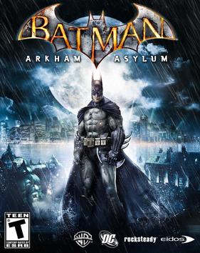
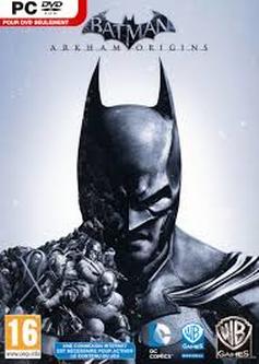
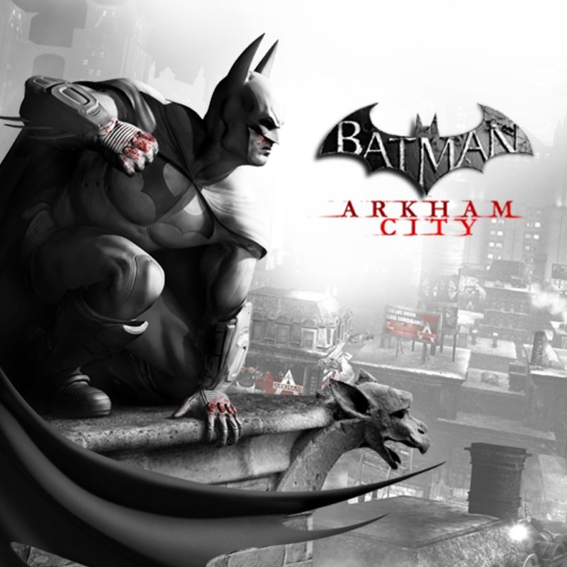
Batman & Arkham Video Game
|
|
|
The Batman & Arkham Video game, is available on Different Video Consoles, such as PS4, Nintendo DS, XBOX, PS3, and Games for Windows. This shows the success of the Batman Franchise as it shows Cross Media Convergence and Synergy, as the company has now formed synergistic relationships, with PlayStation, Xbox and Nintendo
Batman Synergistic Relationships
|
|
|
The Batman Franchise has formed synergistic relationships with the Broadcasting Companies Netflix, YouTube and Sky. Through this the audience are able to watch the film on the different platforms. This is also an example of Cross Media Convergence, as they are able to watch the movie through different forms of digital media platforms such as IPads, Laptops, Game Consoles, Phones and Tablets.
Neneh
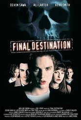
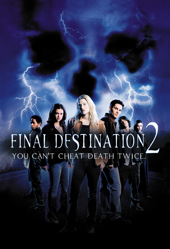
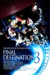
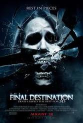
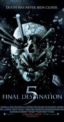
A good example for a horror franchise that used cross media convergence and synergy very well is Final Destination. Final Destination is a collection of 5 different films, which were all distributed by New Line Cinema, except for the fifth film which was released by Warner Brother Productions. Overall within the franchise, they have released 5 films, Final Destination (2000), Final Destination 2 (2003), Final Destination 3 (2006), The Final Destination (2009) and Final Destination 5 (2011), which all together made gross box office total of $665 million worldwide. Final Destination and Final Destination 3 were both written and directed by James Wong, while Final Destination 2 and The Final Destination was directed by David R Ellis and Final Destination 5 was directed by Steven Quale. All 5 Final Destination films were produced by Craig Perry and Warren Zide.
|
|
|
|
|
|
|
|
|
|
As a part of Final Destination Franchise, two comic books were released as a form of merchandise to help promote the Final Destination collection. Both of the comic books were published by Zenescope Entertainment and they were written by Mike Kalvoda and illustrated by both Lan Medina and Rodel Noora in 2006. 'Sacrifice' was the first comic book to be published. When it was sent out into stores, in a small amount of outlets, the comic book came with a special addition, which was the comic book and a limited edition of Final Destination 3.
After a while, Zenescope Entertainment then released Final Destination : Spring Break, which was a 5 issue mini series . In 2009, the mini series was re-released into a paperback version and it included Sacrifice as extra content. |
Dionne
|
the branding and overall feeling to the IT franchise shows how the use of multimedia platforms can change the way that the film is advertised. With the reboot making 123,403,419(usd) the film and tv mini series where also distributed by warner brothers - a large conglomerate. with the films coming two decades apart the CGI effects to the font is the biggest show that this is a reboot , the colours have stayed mostly the same for the poster but is now showing more blacks."IT" had the third-highest opening weekend of 2017.
With the newer film being shown on more media platforms it has salos gotten its own mini game which is on their site as well as fan made games and interactives on their website. they created a vr trailer for the ' it experience later this year. this has lead to a large amount of youtubers playing the game for free and creating even more free advertisements to the game. due to its success in the past and now the producers have already published a release date for the 9th september 2019 It : chapter one (2017) VR experience: http://vr.itthemovie.com/#_=_ The sewer game: http://game.itthemovie.com/ 
|
|
.the reboot has been produced by New Line Cinema (presents), RatPac-Dune Entertainment (in association with), Vertigo Entertainment, Lin Pictures
and KatzSmith Productions with the loder one being created by Green/Epstein, ProductionsKonigsberg/Sanitsky , CompanyLorimar Television, Warner Bros. Television
and KatzSmith Productions with the loder one being created by Green/Epstein, ProductionsKonigsberg/Sanitsky , CompanyLorimar Television, Warner Bros. Television
|
|
|
|
|
|
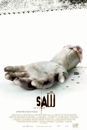
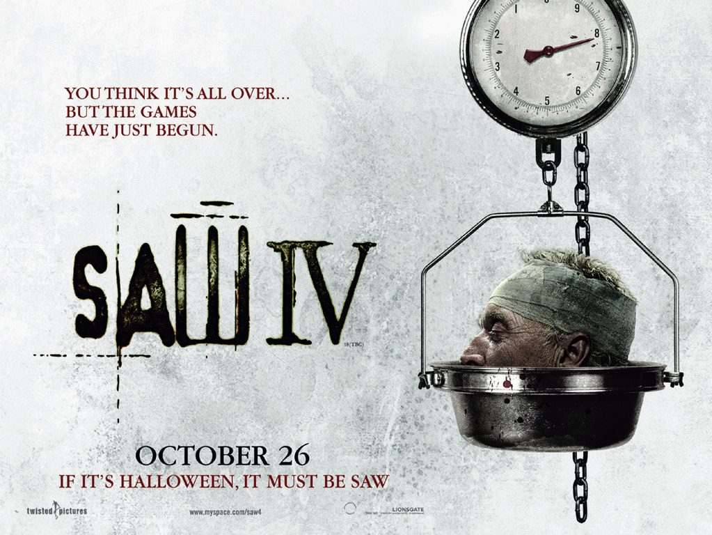
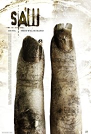
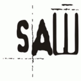
Saw trailer and poster - Dionne
|
font : The fonts that were used for the first saw film is repeated on all of the posters later on in the franchise. however different fonts were used in the trailer - the films are still successful due to the continuity of the differences.
colour scheme: the colour scheme is consistent in its use of cool tone colours (blue , white) and the browns and red that it uses for its posters are seen in the trailers to show the dirt and blood form jigsaws traps. The colour scheme for the posters is a little lighter even though it shows some of the gory parts of the film character: the poster for the 4th film shows the head of the 'original' jigsaw the others however focus o the various body parts. This is shown through out the rest of the posters however and show the films brand effectively to the audience |
|
|
|
Laura Isabel Lozano-Robles
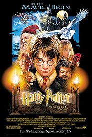
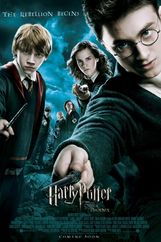
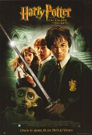
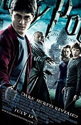
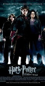
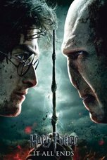
Harry Potter is a British-American film series based on the Harry Potter novels by author J. K. Rowling. It is a Fantasy Fiction film and book franchise, the 8 films have earned more than $7 billion in combined global box office sales. Synergy and cross media convergence has helped the series become as successful as it is today.
|
|

|
|
|
|
|
|
|
|
|
The movies and books are not the only things which have helped this global phenomenon become as successful because this has also lead to there being games with big video gaming brands:
An estimated $7.3 billion has been made in game and toy sales for toymakers such as Hasbro. |
|
|
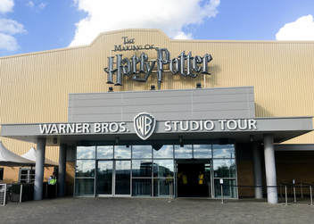
The Harry Potter Warner Bros studio was created after all 8 films were completed with remaining sets that had been created for the films. The Harry Potter studio in 2012, was rated by TripAdvisor the highest rated attraction in the world every year since.
|
|
|
|
|
|
“Harry Potter and the Cursed Child,” a script for a West End stage play set in the "Harry Potter" universe, was the highest-selling print book of 2016 by more than 3.2 million copies. We can see that there is a still an audience 20 years after the first published book, we see the expansion of an idea which became one of the best selling books ever to award winning films series to receiving 9 Oliver awards for Harry Potter and the cursed child. |
Trailer and Poster
Laura Isabel Lozano-Robles
|
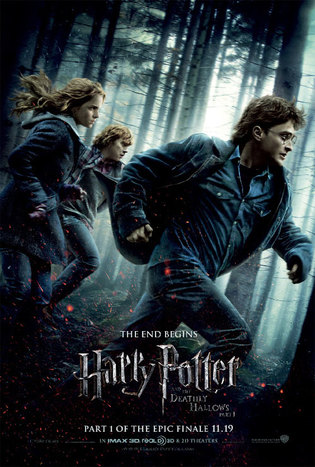
Characters: The trailer and the poster show the three main protagonists focusing on the main protagonist. By including the canes from the trailer in the poster is creates a familiarity for the audience who already have familiarity in the franchise. By having the same protagonists on the poster running away the audiences have there answer by seeing who they are running away from in the trailer however the cliff hanger is why and who specifically which is what would be answered in the film. they connect all three. The characters make the franchise recognisable.
Colour scheme: from looking at both the poster and the clips of the trailer we see a continuity of colour the washed out colours mostly grey and black, from seeing this you would assume that the plot is quite dark and something is about to occur in addition to this the Typography/Font: the font used for the poster and the trailer is the same keeping the continuity of the franchise together and also connecting with the colour scheme. |
|
Characters: by having the protagonist as the dominant image on the poster it creates a sense of continuity whilst still leaving that enigma of the storyline and who the antagonist is.
Colour Scheme: the scene which is displaced on the screen in the form of a GIF was the the action behind our idea for the dominant image for our horror poster. sot eh action of who is the hand covering the protagonist face and why is she in that situation is some what answered in the trailer which then leads the audience to wanting to watch the film which leads to the marketing of the film to be successful.
Colour Scheme: the scene which is displaced on the screen in the form of a GIF was the the action behind our idea for the dominant image for our horror poster. sot eh action of who is the hand covering the protagonist face and why is she in that situation is some what answered in the trailer which then leads the audience to wanting to watch the film which leads to the marketing of the film to be successful.
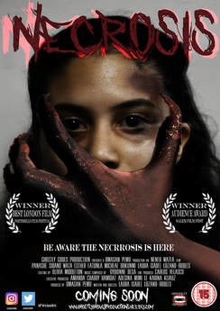
Poster and Magazine - Dionne
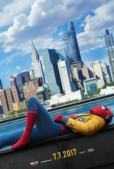
|
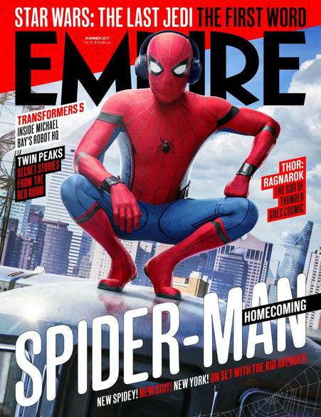
|
Characters: on the poster and the magazine the main character spiderman is shown we can see this from the 'suit' design that is made for each super hero character this is effective as they are usually continued across the brand and for the produce. the headphones featured are alos in both images again linking them together
Font: the font is the one thing not carried across into the magazine. this is as it is less important than the image and also as the font was not released with the initial poster.
Colour scheme and backing : the colour scheme is mainly red,blue and white. which is consistent with the themes done before this and shows that the two are related. in the background you can see 'stark' tower which has been edited into both. this shows that we are in what is called the marvel universe and is successful in linking this film to the brand.
|
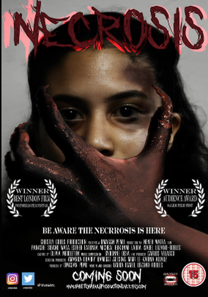
|
Characters: the antagonists hand is the main thing that shows us the consistent use of characters in both our magazine and the poster.. the smaller images (screenshots from the trailer) shows the main protagonist - played by laura.
Font: the fonts (who asks satan and true lies) are kept on both the poster and the magazine this is to show that the films are the same and not different film with the same title this is to avoid confusion when looking at the images side by side.
Colour scheme: the colour scheme relies mainly on red and black with the white use for smaller text and accents to the images this is effective in showing it as a horror due to the connotations of the colours
Trailer and Magazine
Neneh Watfa
Example : Stranger Things
|
|
|
|
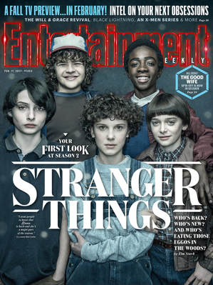
Fonts : The same typography that is used through out the trailer for their title slate is the same typography that is used on the magazine's main cover line, maintaining their brand identity. The magazine adapted its typography for their other cover lines to the same typography that is used in the title slates and the magazine's main cover. The magazine kept their masthead the same font but only changed the colour to fit the stranger things theme for the magazine. Keeping the same typography through the title slates and magazine cover helps to promote Stranger Things franchise as a whole as it helps the audience to remember the products from the franchise and their brand identity.
|
Colour Scheme: For the masthead and the main cover line, the magazine adapted their colour scheme to fit the Stranger Things colour scheme, meaning that the magazine would be seen as a special edition as it adapted its colour scheme an typography to fit the Stranger Things theme. The magazine decided to use whit instead of red for the main cover line due to the fact that,white is more bold and stands out more, attracting the audience as it is eye- catching.
Characters: all five of the main characters, including the four boys and the main girl that feature inside the trailer have been presented on the front cover, which helps the audience recognise the Stranger Things franchise. Having the five main characters on the front of the magazine helps to promote the brand identity. The magazine decided to only use a main dominant image and they made sure that it was centre of the magazine and the most eye- catching assets of the magazine, which again helps and links to the promotion of the franchise as it will help make it more recognisable. |
Our Product
|
|
|
|
Colour Scheme: We had to maintain the same colour scheme throughout all three of our products, so keeping the colour scheme consistent in our trailer and on our magazine. we stayed with the same black, white and red colour scheme, which again would help to promote and build our brand identity as these are the colours of our main logos. For the masthead and title slate, we used the same colour as our logo, aiming to keep consistency with our colours, we used either red or white for our other cover titles as we did not want to venture outside of our chosen colour scheme, s this would have disturbed our brand identity.
|
Characters: To maintain our brand identity, we used our protagonist as the main dominant image on the magazine. This is the focus of the magazine as it is one of the bold features that stands out and attracts and audience. Showing one of our main characters on the magazine helps to promote our brand identity and making it recognisable but it also helps the protagonist to become iconic to the audience, helping the audience to recognize the film on the magazine and inside the trailer.
Titles: For our title slates, we used the same typography for our film title name and billing block for the magazine, which shows consistency, which helps to keep up our brand identity. Using the same typography is important to keeping up a brand identity as it is the one key factor which makes your brand stand out from other brands and helps the audience remember your brand identity and promoting it. With the magazine, we kept the masthead the same of the official magazines, but we changed the magazine’s colour scheme to fit in well with our trailer, changing the colours of the cover lines. We changed the magazine’s main cover line and title slate to the same font of the typography and colour and effects of the film title’s Necrosis. Doing this also helped to promote our brand identity and our franchise to our audience.
|
Trailer and Website
Omasan Pemu
Ghostly Ghouls Trailer and Website
Click to view the Ghostly Ghouls website -> Ghostly Ghouls Website
Ghostly Ghouls Merchandise website created by Omasan Pemu.
|
These are screenshots of the Ghostly Ghouls website, which a subsidiary of the Ghostly Ghouls Production Franchise. The websites includes recognisable conventions, of the horror Genre. In order to ensure that the website is part of the Ghostly Ghouls website, we used our Brand identity, which includes our the our typography and logo. Which are shown on all Ghostly Ghouls products.
The colour scheme of the website is congruent with the trailer, which also shows the branding of our trailer, which are the White, Red and Black. The font on the website is also consistent. There are a different variety of Merchandises available to buy, such as beanies, jumpers, shirts and phone cases. Which all include the Ghostly Ghouls logo. |
The Ghostly Ghouls Teaser Trailer includes the same typography as the website, which shows consistency. There are also images of our Iconic claws featured on the Ghostly Ghouls Website.
While comparing both our Trailer and Website, it is clear that they are both products of The Ghostly Ghouls Productions Franchise, as they both consist of recognisable conventions. |
|
The Ghostly Ghouls Merchandise, consist of beanies, hoodies, phone cases and t shirts. As you can see we used our Brand identity on the merchandises, which is the Ghostly ghouls logo. but on different types of items. We used a variety of merchandises as we wanted the audience to have a selection to choose from.
|
|
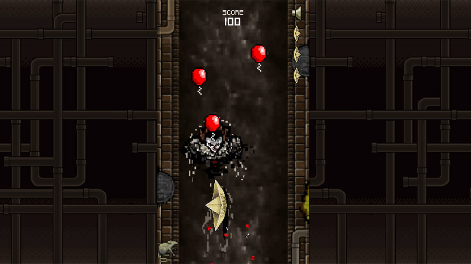
IT Website and Trailer
|
|
|
The IT website and trailers, are both products of The New Line Production company. As you can see it is a niche market as their main target audiences are people who watch Horror movies. Which is similar to the Ghostly Ghouls Productions Franchises, as our main target audiences are people who watch Horror movies.
On the IT website the soundtrack is made available to buy, and listen to on Music streaming apps such as ITunes, Deezer and Soundcloud, which shows examples of synergy and Cross Media Convergence.
Both the website and the trailer include, recognisable features, which allow the to correlate with each other, such as the red balloon, which is a very popular feature in the IT branding. As well as this the typography is also consistent throughout.
Logos
Brand Identity
Neneh Watfa
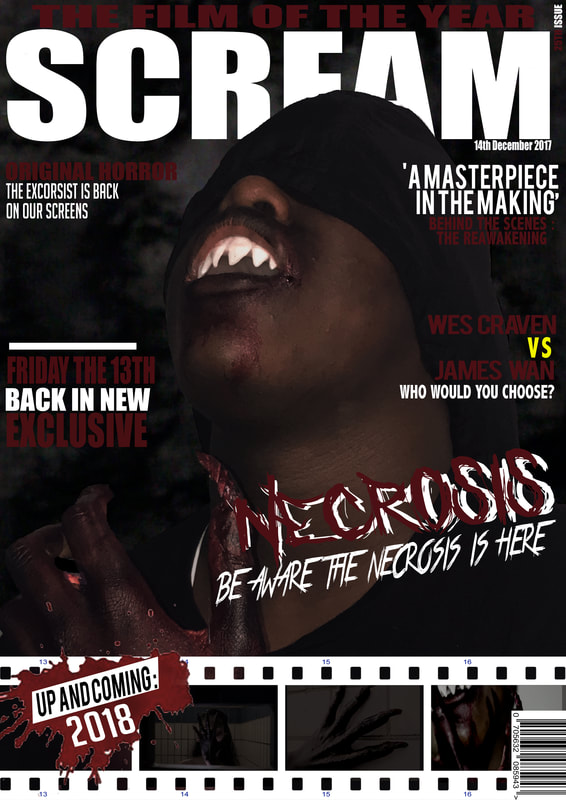
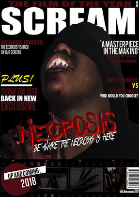
Branding and having a brand identity is very important with helping promoting our film, Necrosis. To maintain our brand identity, continuity was key through out all of our main products, this is key as it helps to to brand the film, making it more recognisable. Keeping our ancillary texts the same colour scheme, the same font size and same typography was key to helping our brand identity. We had to keep our main colour scheme, which was Black, Red and White, when designing all our products , which again helps with our brand identity. Typography and colour scheme together are vital with strengthening our brand identity as the two combined is what actually makes our brand as it is the first and most vital thing that people will see and remember. A way that we used typography and our chosen colour scheme was our film name we found a font using dafont.com that we though best presented our film for typography and used a two tone red colour, using a lighter red for a drop shadow. Having a bold and clear brand identity is vital as it helps to distance our horror film products from another horror film product.
Below are examples of Real Media Texts and their brand identities.
Below are examples of Real Media Texts and their brand identities.
|
|
Our Product
Above is our made brand identity. This will become our one of the main recognised brand for our media products which will help to enhances and promote our franchise overall. As our main logo, it will be used on a high amount of our merchandise. Our brand identity differs from other monster or slasher horror films as our brand identity is unique and uses a different type of typography that is not used in monster films but could sometimes be used inside slashers. Our film title uses a show shadow effect background of a lighter red than the title is s well as using a scratch font.
Brand Identity
Branding is an important element, especially for a franchise, branding helps their distribution company, as it the key factor in making sure that their films reach their target audience. Branding creates a sense of security as it shows the audience that the film has high quality and the production company behind it is official. Brand identity helps to promote and connotes the genre and what your media products are about. Logo’s tend to have consistent typography which is then used and adapted to the other subsidies that lie inside the franchise, which is what we created down below.
Ghostly Ghouls Corporation is a horizontally integrated conglomerate, with over 5 different subsidiaries that within the franchise all have a different role of distribution in different areas within the media industry including film, animation, music, etc.
Ghostly Ghouls Corporation is a horizontally integrated conglomerate, with over 5 different subsidiaries that within the franchise all have a different role of distribution in different areas within the media industry including film, animation, music, etc.

|
|
Distribution Company
|
Ghostly Ghouls Productions mainly focuses on the distributions of Ghostly Ghouls production films and maintains the distribution of all released content to the mainline cinemas and also any other channels in synergy with Ghostly Ghouls Productions. With links connecting to other various media channels such as Amazon Prime, Netflix, Sky, this means that our films will not only be showed in cinemas but also can be promoted and shown on platforms which are widely available within the home. Ghostly Ghouls Productions is a widely know subsidiary from the franchise Ghostly Ghouls Corporation, with Ghostly Ghouls Productions owning and managing the film section of the franchise. Having a wide franchise with many different subsidiary within allows us as franchise to become more recognisable, meaning that we would maintain a bigger income, which would then means there will able for more to go towards funding production films and merchandises that are of higher quality. Ghostly Ghouls Productions helps the franchise to reach a rather audience, gaining new audience members, expanding our audience expectation as a whole. Using synergy with different media platforms, allows the subsidiary to make use of cross media convergence as whole overall, again helps the franchise to expand and gain new audience member every day.
|
Television Companies
|
Ghostly Ghouls Television maintains the distribution and promotion of Maintains and distribution and promotion of our television shows out to platforms such as Freeview, Sky, Virgin media and also online television platforms such as Netflix, Amazon Prime all across the world and is always instantly available to watch at any time. An example of our channel which would be available on all television is Ghouls Tv, which not only will have behind the scene documentary of the film making and actors talking about the film and how they found starring it, we would also have other content on our channel, including a TV series. Our channel would be available on all possible platforms, which is a form of cross media convergence as we are not only using television but also online to help promote not our film but as a whole our brand franchise. This would then lead to our film receiving more promote, increasing sales, meaning the franchise would then start to make a profit.
|
Music Companies

|
Ghostly Ghouls Records is a subsidiary outside of Ghostly Ghouls Corporation that owns and manages all music distributed and released. It is the producer of the soundtrack which feature inside all our media products, such as in our trailer premiere, film and this then became the theme sound which is featured inside our TV programmes as well. While Ghostly Ghouls records produce and distributes through Ghostly Ghouls Corporation, we also distribute our music records to other media platforms which allows our audience to listen and stream music through platforms such as ITunes, Spotify, Youtube. As well as distributing songs on an online platform, we would also distribution physical hard discs into record stores but also major supermarkets which sell CD’s. Having this type of synergy within our franchise helps widely to promote our brand identity and franchise as it is being promoted on multiple platforms.
|
Game Companies
|
Ghostly Ghouls Entertainment is the gaming subsidiary of the Ghostly Ghouls Corporation Franchise and they are are in charge of all interactive games, apps which the franchise produces and released. Ghostly Ghouls Entertainment helps to promote our film and also uses a whole new form of product to reach a new audience platform, while generating an extra profit for the franchise throughout the use of cross media convergence helps us to reach our audience, using different platforms and the Enterainment section of the Ghostly Ghouls Coropration helps with that. The subsidiary is current working with different software companies to create multiple animation games of the Necrosis to be released and available to the audience.
|
Publishing Companies
|
Ghostly Ghouls Publishing Ltd is a upcoming publishing company within the Ghostly Ghouls Corporation. It is currently working alongside DC. Thompson to collaborate and create a comic book supporting the new release of film 'Necrosis'. Creating a comic novel for our fikm, helps to reach a whole new level of audience as some people may not be interested in games but instead book, which again helps us to connect and branch out to our audience .
|
Synergy through other platforms
Websites
Neneh Watfa
|
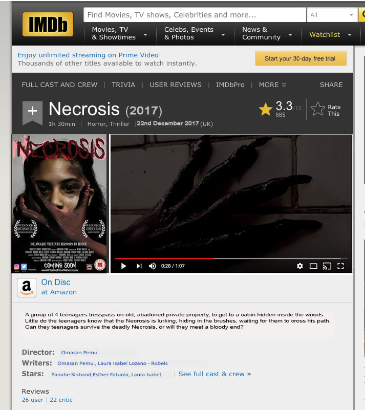
Here is a screenshot of our film's IMDb Page. IMDb ( Internet Movie Database) is a online service which allows you to search up any information ,relating to actors and actresses, films, television programmes, and video games. IMDb is a highly top recognised websites and has around 51 billion regular users. On our IMDb page, we used our official poster, the same one that we used for cinema posters and promoting our film. We made sure that our IMDb page has all the basic elements that each IMDb page included such as our trailer in full, the certification it received, our release date, the plot summary. directors, and actors.
|
|
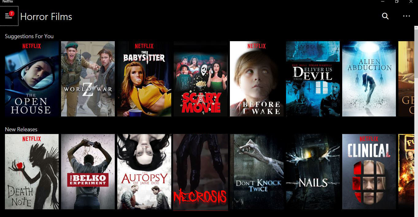
This is a screenshot of our film being released on Netflix and being shown in the new releases section within the horror genre on Netflix. Netflix is a monthly based subscription online service which allows you watch films anywhere you like, TV, Mobile phone or Laptop. Instead of using the images from the magazine or poster, i decided to use a screen grab from a part of the trailer, i did this, to change up the images we would be using for advertising and promotion but something that would actually engage someone, instead of seeing the same images. However i still used the same typography and color scheme for the title as it helps with brand identity and helping people identify that this is still the same film, just a different image from the film is being used.
|
|
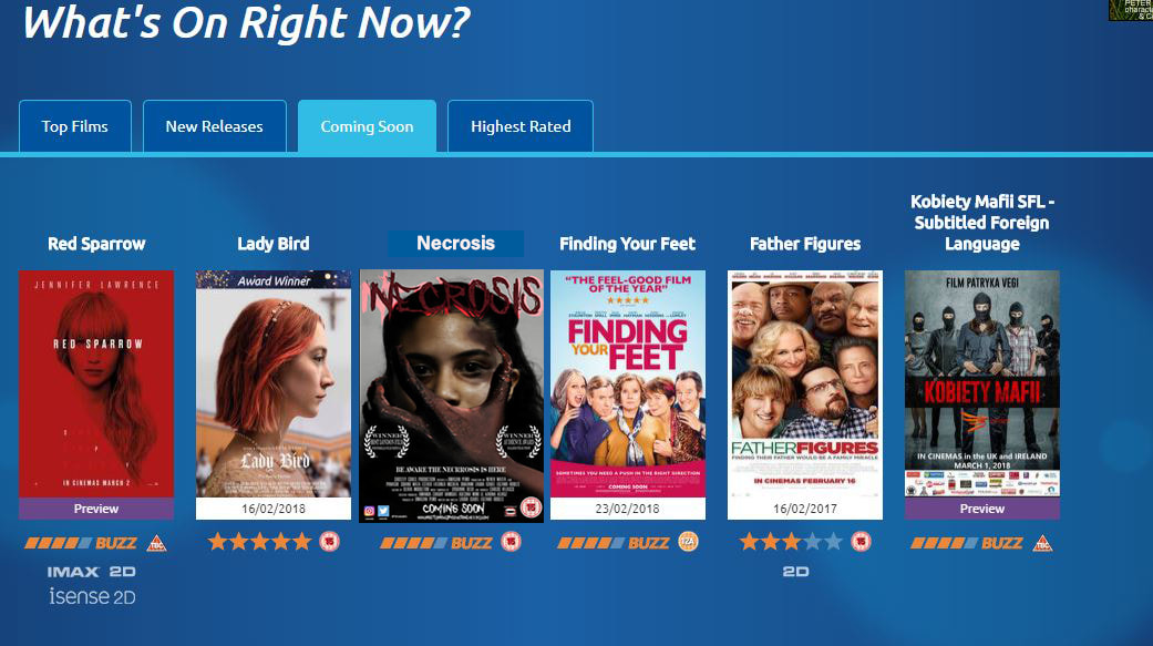
,This is a screenshot of our film on Odeon Cinema's coming out soon page for their most top talked about films that are to be released soon. Odeon have an amount of 122 cinema branches within the United Kingdom and currently holds the position for largest cinema chain within in the UK . At the bottom of the home page is the ' What's on Right Now' section and has different subsidiaries such as new releases and coming soon. I choose to feature our page on the Coming soon page as many cinema lovers look at this page a lot, especially to see what new films are coming out in cinema ,so this screenshot represent promotion of the film before it was actually released as people could see the trailer and poster for our film and rate how excited they were for the film to be released. We followed Odeon's conventions of using the poster for image in the coming soon section, where everything such as typography and color scheme stayed the same.
|
Billboards
Laura Isabel Lozano-Robles
|
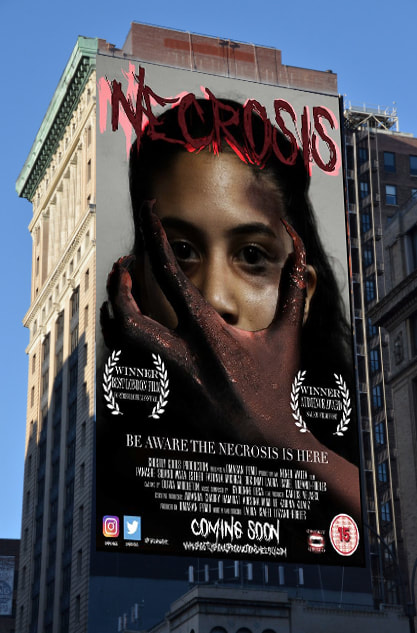
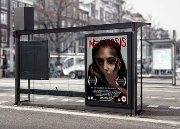
This is the official bus-stop billboard for our film NECROSIS. This form of advertisement helps with our promotion of our film because the placing for this poster allows a range of audiences to view it. Audiences travelling in cars, buses motorbikes etc, in addition to pedestrians walking past or standing at the bus stops. by seeing the poster it may attracts an interest to wanting to go and watch the film increasing the box office value. Furthermore in this day and age where a high percentage of the population uses social media; the social media icons we have on our poster could influence audiences to share the poster on social media gaining more audience becoming aware of the film.
|
|
Games/DVD
Laura Isabel Lozano-Robles
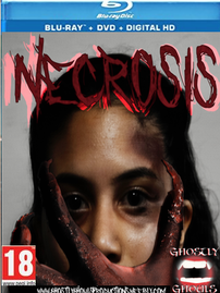
The Blu-Ray is a format of DVD designed for the storage of high-definition video and data. This allows our audience to get a better quality while viewing our film. In addition to this it also include extras of the film that our target audience may enjoy for example behind the scenes and bloopers
|
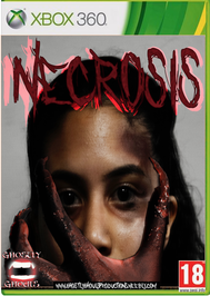
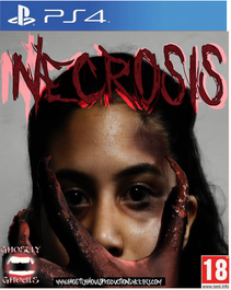
The PS4, and XBOX are video games which are popular within the audiences between 12-21 year olds: which includes a majority of our target audience. so by creating and releasing these virtual games we are able to target our audience while also promoting our film in addition to this we can also gain new audiences.
|
|
Film Album
Dionne Desa
|
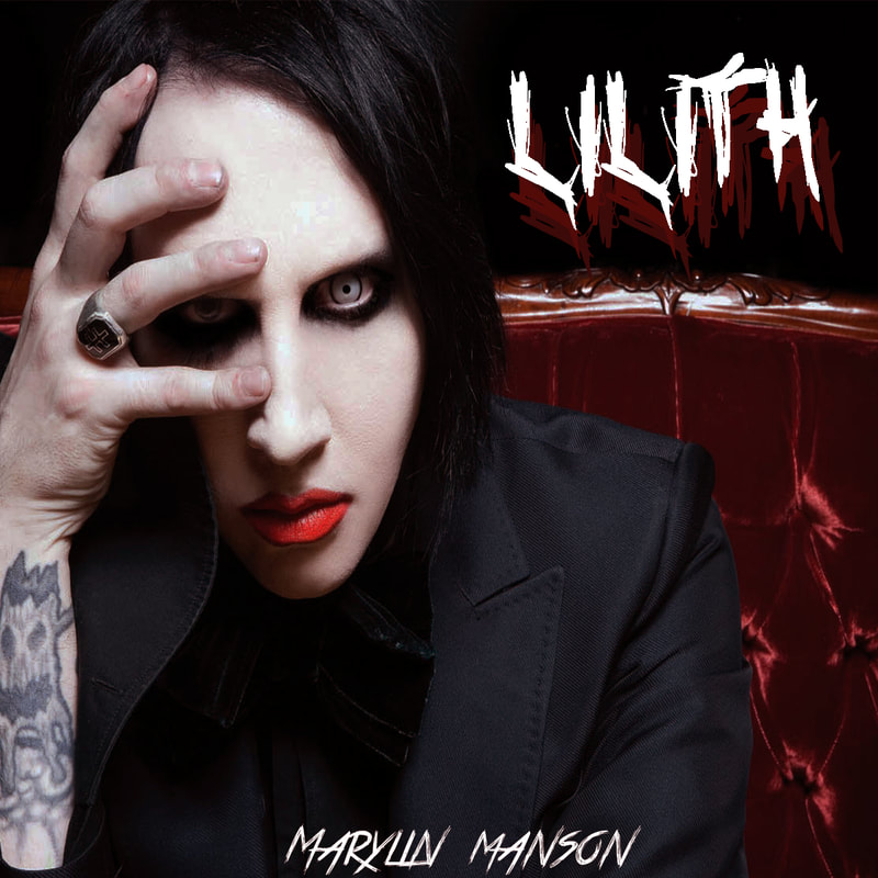
this is what our album cover would look like. It follows the brand identity due to the colour scheme and text used (who asks satan and true lies) which has been used for our trailer, poster and magazine. we chose Marylin Manson as our musician as we believe his original style of music would suit our film.
|
Wikipedia
dionne desa
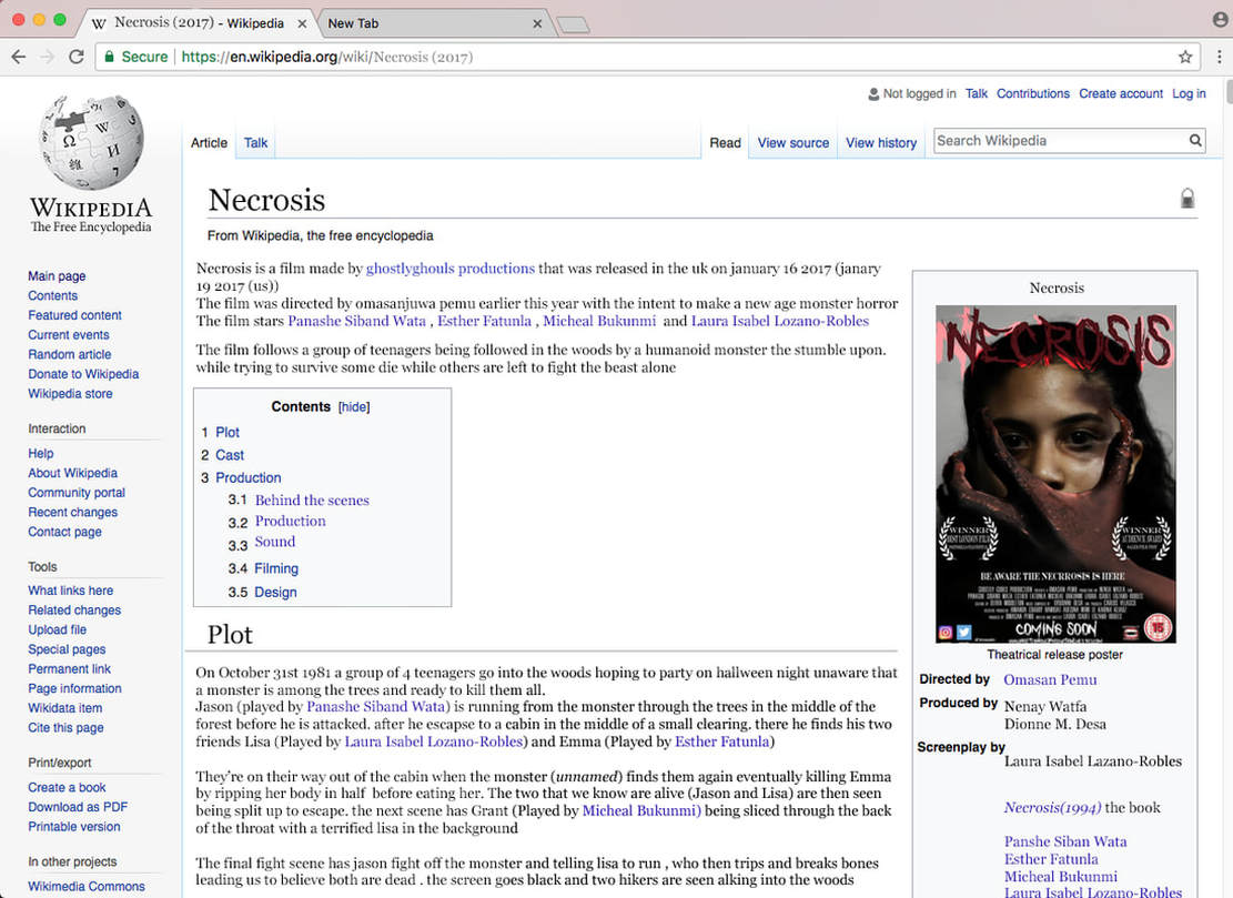
this is the Wikipedia page for my groups film. it includes background information, the plot and more. this site successful due to the fact that it closely resembles RMT as the site is free it also makes it easier to create for student's. the links to other pages are in bold this is so that people are able to navigate the site easier. it is essential to use sites like this as the original page may be changed by others with a log in. this is also successful as the fan base of films can add theories and references to different parts of the article. our article includes a/an over view, plot,poster image, all of the names on the billing as well as link to other questions like behind the scenes. the website is less realistic due to the lack of contents for the page this indicates to the audience that it is a student film.
as a template for what should be included I looked at both the 2017 edition IT and the film Get Out.
as a template for what should be included I looked at both the 2017 edition IT and the film Get Out.
