jiiddd
Typography
By Dionne Desa

|
|
|
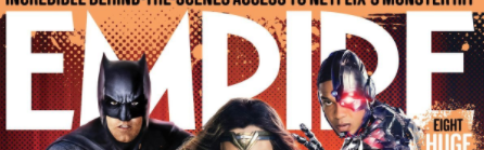
Our magazine header uses the structural conventions of a film magazine. One way it does this is its Masthead. As it is the brand of the magazine it must be clear to read and simple so that it is easily recognized. This is successful in our magazine as the font is sans serif and therefore clear and easy to read. this is successful as the audience will recognize it. it also makes it recognizable to other magazine readers as the masthead due to the fact it is the largest piece of text on the page and placed at the top. This makes the magazine look proffesional.
|
some comparisons that can be made to real media text:
- the colour of the title - the style of font (not the typeface) -positioning - size of text the magazine we used to compare is EMPIRE which is a film magazine and not a horror magazine this made it easier to emulate. this is as horror magazines have a smaller audience and market and would have been less successful to recreate. |
Sub-genre
by Dionne Desa
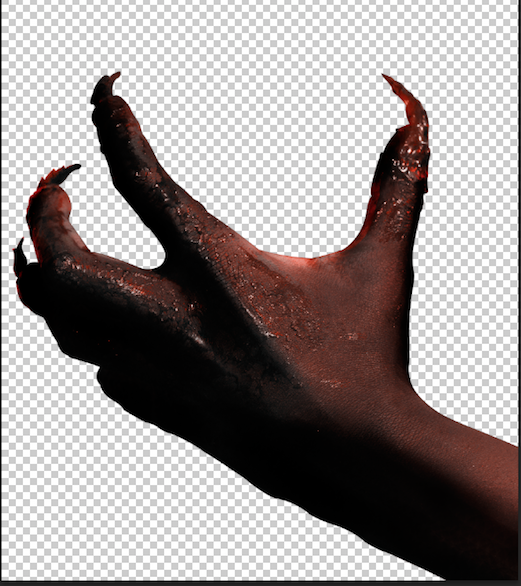
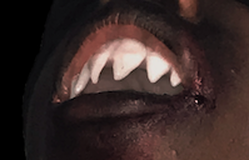
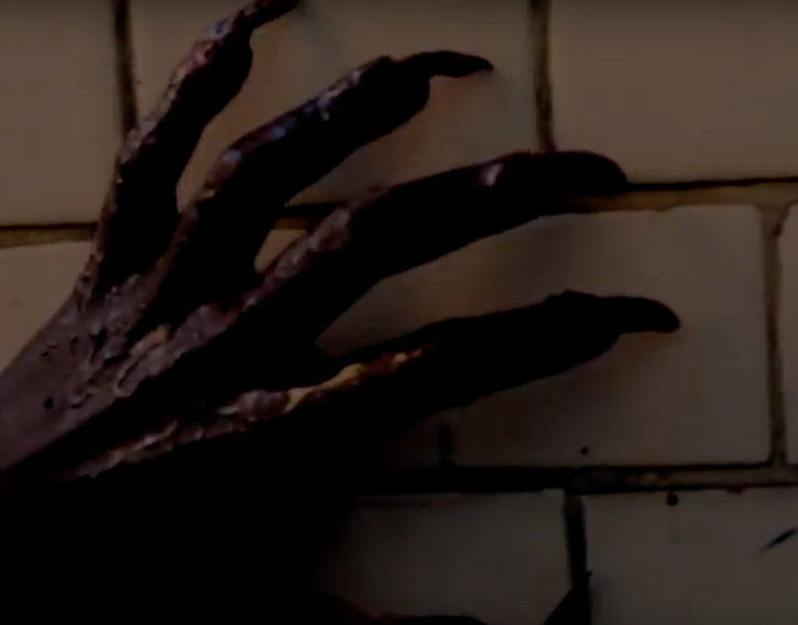
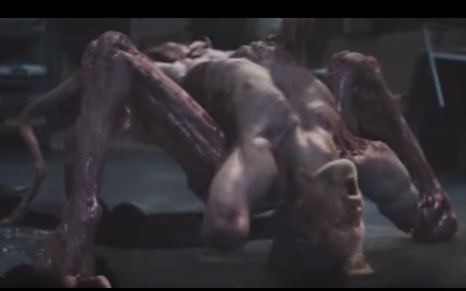
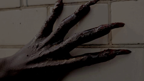
The sub genre of our film trailer is monster it USES the conventions of a monster horror but due to the fact that horror genre is permeable it also CHALLENGES the conventions due to the fact it USES conventions from slasher horror.
|
|
|
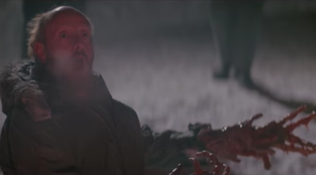
This can be compaired to some of the transformations in 'The Thing' as most of the body stays the same with parts of the body mutating. another way this film can be matched it the idea that the monster is super human or not human. however the film can also be considered a crossover with the slasher genre.Our trialer follows the conventions of a humanoid monster film. its body is created to be weaponized this is shown by the claws and teeth. this is due to the fact we have a final girl and how the other characters are dressed and would have been killed off. i believe that this is a SUCCESSFUL use of both genres as it humanises the monster. however due to the clothing of the monster it makes it less realistic.
|
|
stock characters
By Dionne Desa
|
|
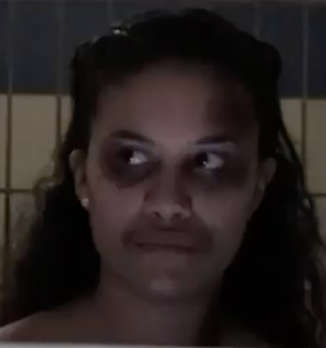
stock characters of another convention of horror films. in our trailer all of the characters are stock characters to make creating it simple and recognisable to the audience. to develop and convey this to the audience we used mise-en-cne. slasher films use very basic stock chararcter. in out trailer we have ; the final girl, the jock, the nerd, the dumb blonde. the rmt that connects this to our work is scream due to the age of the characters and the style weve used to portay them. however we challenged this by having the final girl be feminine and not masculinized by the deaths of her friends.
in conclusion our characters resemble others within the genre and make them recognisable this is successful to the trailer, however, there is no real challenge to the conventions as there are no changes to the stock characters that have not happend before (like what we can see in 'the cabin in the woods'
in conclusion our characters resemble others within the genre and make them recognisable this is successful to the trailer, however, there is no real challenge to the conventions as there are no changes to the stock characters that have not happend before (like what we can see in 'the cabin in the woods'
Posters
by Laura Isabel Lozano-Robles
Subject/Imagery
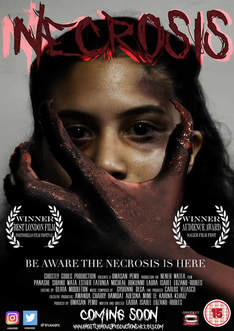
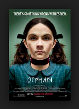
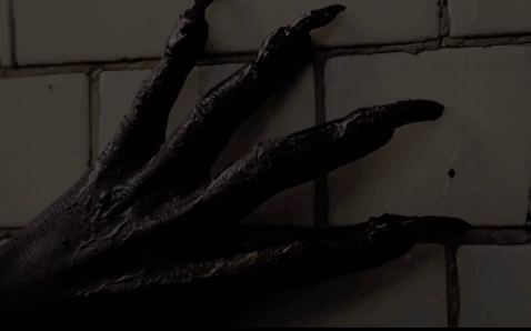
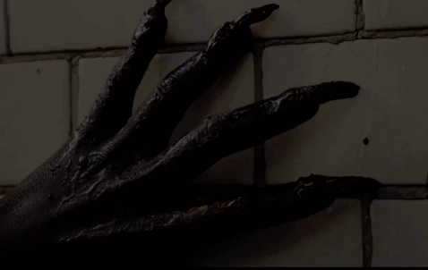
The photograph we took for our Horror Poster was a close up with the subject of the photograph having direct address with the audience creating that uneasy feeling (audience participation) this attracts a specific audience who enjoy feeling visceral pleasure as the uneasy and awkward feeling is what attracts them to the poster which results in the audience going to watch the film. We used "Orphan by Jaume Collet-Serra 2009" as inspiration for our camera angle and pose.
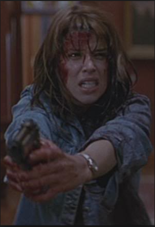
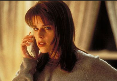
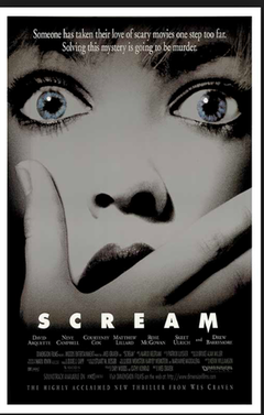
One of the real media texts we used for creating our poster was "Scream Directed by Wes Craven 1996" and the idea of having the hand covering the mouth connotes the idea of entrapment which is one of the themes for our trailer, another way in which this theme is explored in our work is in the trailer by having scenes with police cells; the sole purpose of a cell is to keep people or animals inside not letting them out. So with the hand covering her mouth it connotes the idea that she is stopped from seeking help which results in the advertising being successful as the target audience know wish to see the film to understand why the protagonist is being stopped from speaking and what is she being stoped by.
One of the real media texts we used for creating our poster was "Scream Directed by Wes Craven 1996" and the idea of having the hand covering the mouth connotes the idea of entrapment which is one of the themes for our trailer, another way in which this theme is explored in our work is in the trailer by having scenes with police cells; the sole purpose of a cell is to keep people or animals inside not letting them out. So with the hand covering her mouth it connotes the idea that she is stopped from seeking help which results in the advertising being successful as the target audience know wish to see the film to understand why the protagonist is being stopped from speaking and what is she being stoped by.
Billing
Laura Isabel Lozano-Robles
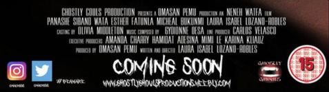
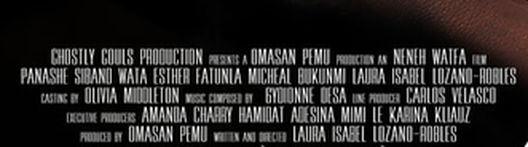
In our Horror Poster we followed the conventions of including a Billing Block. We used a billing block template which meant that i added the names and position of people who worked on the film this would allow my Horror Poster to be recognizable to fans of the horror genre. The names of the actors and the roles that they done were included to allow them to get the credit because of how they were involved in the making of the production.
|
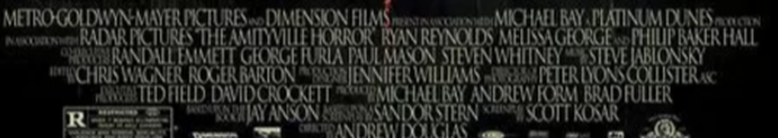
The Amityville Horror- 2005 Andrew Douglas
The Real Media Text that we were inspired from for the billing block was "The Amityville Horror" the idea of having the copy set in perpendicular lines allows the eye to travel down across the page to lead you to the website and social media icons.
|
Social Media
Laura Isabel Lozano-Robles
|
In our Horror Poster we followed and used the conventions of having social media icons on the bottom part to allow the audience to see more information on the social media accounts for the film. This attracts a younger demographic who see these advertisements and want to find out more on the film which will then make them want to go and watch the film increasing the box office value.
|

|
Website
Laura Isabel Lozano-Robles

|
In our Horror Poster we included another convention of having the Website on the bottom of the poster. By having the website on the poster it allows the audience to find more information on the film which will get them interested in the film. The poster is an old fashioned way of advertising a film however it is the easiest to view anywhere as some people may not have access to a digital device so a poster on a bu, billboard, bus stop etc could grab there attention.
|
Tag line
Laura Isabel Lozano-Robles
|
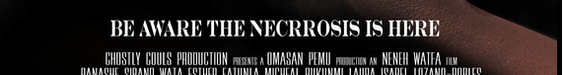
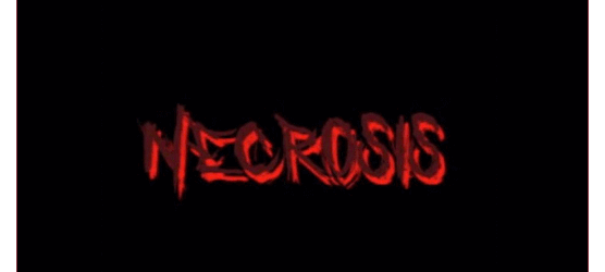
We conformed to the Horror poster conventions of having a a tagline "BE AWARE THE NECROSIS IS HERE" that rhymes for the purpose of allowing the audience to remember it; it creates a dramatic effect on the audience leaving rhetorical questions of: who is the Necrosis? why do we have to be alert? etc. The tagline for the poster will intrigue the the target audience in to watching the film.
|
|
Laurels
Laura Isabel Lozano-Robles
|
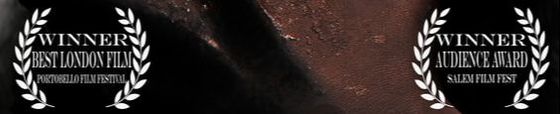
The laurels grab the attention of a specific audience which are the critics; there attention will be focused on the awards the film received. Not only will it attract critics but audiences who prefer to watch films who have been professionally awarded and are critically acclaimed.
|
Conclusion
Laura Isabel Lozano-Robles
Overall our Horror Poster used different Real media texts mixed with the Horror Genre conventions to allow the Horror Poster to be recognisable to Horror fans which primarily are the target demographic. By using more than one real media text( Orphan, Scream, The Amityville Horror) we were able to use there different conventions which can be recognised on screen by different fans of the those Horror film for example some fans may recognise the scream element of the hand covering the face or a Orphan fan may recognise the camera angel and the way the protagonist is posing towards the camera all these attributes will make these specific fans interested in watching our film which will lead to an increase at the box office making the film successful.
Trailer
Omasan Pemu
Teaser Trailer - Necrosis |
RMT - The Conjuring 2 Teaser Trailer |
Todorov's Theory
Todorov is a genre theorist, who talks about the stages of a trailer. He mentions 5, however there are only 3 important stages. Equilibrium, Disequilibrium and Resolution.
Due to the fact that trailers have a non linear structure, which included, texture shots, disruption and monatge. Only Disequilibrium applies to our work. As trailers are only meant to included the scariest and best parts, which is an advertisement skills, to attract the audience to watch the movie.
Due to the fact that trailers have a non linear structure, which included, texture shots, disruption and monatge. Only Disequilibrium applies to our work. As trailers are only meant to included the scariest and best parts, which is an advertisement skills, to attract the audience to watch the movie.
Disequilibrium
|
In our trailer, we would not include a disequilibrium, as our trailer doesn't follow a structure due to the fact that it is non linear. So instead we have our disruption and montage,. These are where the best parts are included and it has the highest level of tension. The Disequilibrium is the main part, as it is what attracts the audience the most. We have used Sound, lighting and editing to make the disequilibrium of our trailer. Through this we were able to create suspense, by using fast paced cuts, low-key lighting and non-diegetic and diegetic sounds.
|
|
RMT - Disequilibrium
|
|
During the disequilibrium section of the trailer, the children toy starts playing on its own, and there were strange sounds happening. Due to the fact that this was a teaser trailer, they were unable to show all of the good parts, as they were only trying to tease the audience. It's main aim was to create suspense.
|
RMT - Resolution
|
|
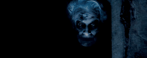
Here is the Resolution to the Insidious. As you can see the antagonist ends up killing one of the Protagonist. The reason why Todorov's Theory will apply to Insidious, is because it is a movie, so they have, and Equilibrium, Disequilibrium and Resolution. Where as our product is a trailer, so it follows a non-linear Structure.
|
Settings
Neneh Watfa
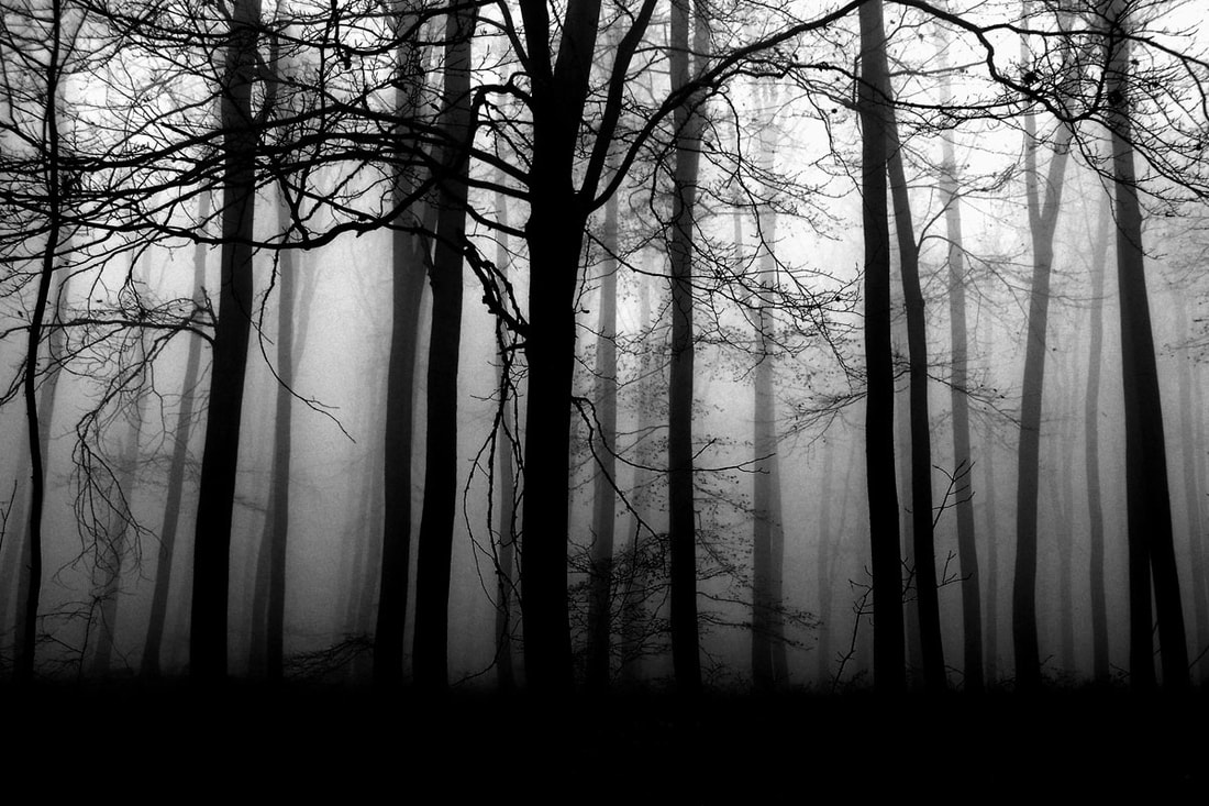
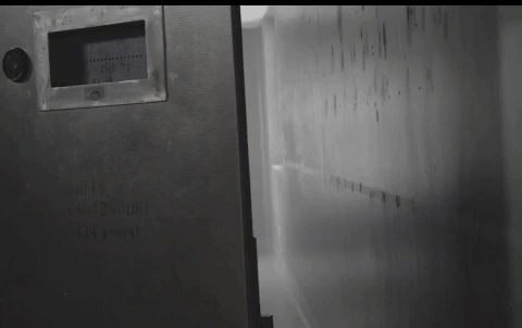
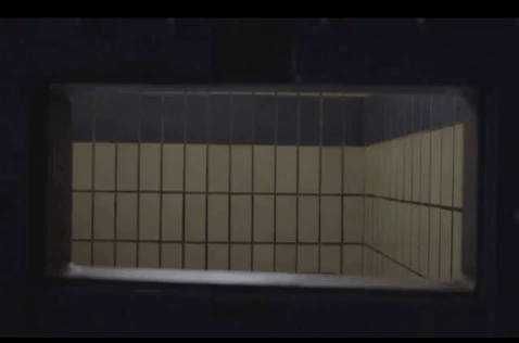
As our horror film is a monster/ slasher film, it was ideal for us to follow typical settings that would be found inside both monster and slasher films. and incorporate them into our trailer. Within our trailer, one of the typical conventions of settings that we used from a slasher was having a forest for majority of our trailer. This was an essential convention for our monster / slasher trailer as it helped portray to the audience what genre our film trailer was going to be.
We challenged the real media text of horror films by adding a police station in one of our locations that is included inside out trailer. We decided to purposely use this setting since it is not a normal setting that would feature inside monster films, hence challenging and breaking the typical conventions of monster films. All the settings that we included, we used to the best of our ability to make sure that the settings were just as effective inside the trailer as the acting. As our film is a monster / slasher, we had to use the most conventional location which would be found inside each film, which a monster includes a dark forest and slasher includes a house near woods.
We challenged the real media text of horror films by adding a police station in one of our locations that is included inside out trailer. We decided to purposely use this setting since it is not a normal setting that would feature inside monster films, hence challenging and breaking the typical conventions of monster films. All the settings that we included, we used to the best of our ability to make sure that the settings were just as effective inside the trailer as the acting. As our film is a monster / slasher, we had to use the most conventional location which would be found inside each film, which a monster includes a dark forest and slasher includes a house near woods.
|
|
Titles
Neneh Watfa
Titles are an important convention used within trailers as they are used to connect with the audience and helps to give them some insight or background information without too much being revealed. When deciding our titles and what should be placed on each one, we used real media text to help us understand the logic behind titles, the idea that they are used to help break up the trailer and create suspense in the audience, making the trailer more effective. We used The Conjuring 2 to help us allocate our titles and where in the trailer they would look most effective and help build up suspense inside the trailer. Real media texts helped us with our titles as we learnt that titles in the beginning tend to relate to other similar films or starts building suspense by dropping small hints of the story line. Teaser trailers are shorter than dramatic trailers due to the fact that teaser trailers only focus on the disequilibrium of the story and only that in the trailer, whereas with dramatic trailers, they have a equilibrium and then they start to show the disequilibrium towards the end of the trailer.
Trailer Length
Neneh Watfa
When deciding the length of our teaser trailer, we decided that our trailer should be no more than 1 minute long, from start to finish, so that the trailer was filled with just enough clips but not to include too many clips were included so that majority of the story line was not revealed inside the trailer. We used real media texts to help create a timeline of what clips should go where, what title slates would be included and how long these clips would be, where montages would be included within the certain time frame for our trailer. Typically real media text show that trailers last anywhere from 00:55 seconds to 1 minute and 50 seconds, but some trailers can last longer, depending on the structure that they choose to follow inside their trailer. When planning out our timline, we used The Conjuring 2 to help us find out where exactly our shots should go, and how long they need to roughly be. The Conjuring 2 timeline also helped us to understand what was a effective structure and sequence to place our clips and timelines and how effective it would. We then followed the typical convention of trailer films by placing the trailer name, release date and billing block at the end of the trailer.

Alien (1979) trailer length

Our trailer length - Ghostly Ghouls
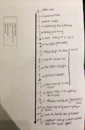
CONJURING TIMELINE
Lighting
Omasan Pemu
Via GIPHY
Low Key lighting is a common convention used in Real media texts. This is to help create, build tension and add suspense. The low-key lighting connotes the mood of the trailer which is meant to be eerie, scary and daunting. This also reveals to the audience that something bad is about going to happen. In our trailer, Low-key Lighting is used through out, as it constantly connotes tension and suspense to the audience.
|
Via GIPHY
Many Real media texts had used low-key lighting to convey many things such as setting the mood, creating atmosphere, and as it is the conventional setting for a jump scare to happen, which the creates visceral pleasure for the audience. However one of the main reason it is used is to show the fear of the unknown, as the protagonist are unaware of what is going to happen next. Which then causes the audience to be scared, and tension begins to rise as the movie or trailer progresses.
|
Editing
Omasan Pemu
MontageDuring our trailer we used a lot of fast cuts, as it helps to build tension, and increase the pace of the trailer. Also it would make the audience feel begin to feel suspense and nervous as they would have to keep up with the pace. Also the pace would conveys the amount of action, tension and adrenaline and fear which are all emotions that are common in the audience of Slasher and Monster horror movies.
I also distorted the video, and i zoomed in and out, and moved the video around, so the audience would have to constantly follow the video, as it also added effect. |
MontageThe insidious montage used the transition fast cuts in their montage which is a typical convention of the horror trailer. The cuts were fast paced, which would have made the audience engage with the trailer. Also it would have added energy and suspense, which depicts supernatural, and paranormal powers, which makes the protagonist feel fear, and intimidated. Also as it is the montage, the level of intensity should be at its highest point.
|
Establishing shotIn the beginning of the trailer, we followed the Conventional structure of a horror trailer, which was to start of with texture shots of the trailer, as this would set the mood and, also show the ,location of our trailer.
|
Conjuring Establishing shotThe Conjuring open with a pan shot of the location, This a common convention used in horror trailers, as it gives the shows where the movie will be set.
|
|
|
Animatic
Omasan Pemu
|
|
From watching our animatic, it is clear that we did not stick to the structure. This is due to the fact that our knowledge developed, which allowed us to become more creative. Also when we were shooting people were gaining better ideas, and we also realised that some of the locations that we originally chose were too expensive or unable to have access to, so we had to change the locations of our trailer.
|
Sound
Omasan Pemu
The sound is a very vital part in the trailers success, as it is the sound that sets the mood, and creates suspense and builds up tension. Our sound track was made up of many different sounds such as, ambient and diegetic sounds, e.g leaves rustling. and also non diegetic sounds, such as booms, and suspense rising sounds.
Ambient & Diegetic Sounds
Ambient sounds - are the sounds which are present in the back grounds of the scene, such as birds singing, windy music, etc.
Diegetic Sounds - sounds made by the object such as voices of characters.
Diegetic Sounds - sounds made by the object such as voices of characters.
|
|
|
|
Non-diegetic sounds
Non - diegetic sound - These are sounds that can only be herd by the audience. As they are mainly used as sound effects.
|
|
|
|
